Staying relevant in an evolving industry
With over 50 years of experience delivering the highest quality urethane products, PSI Urethanes stands unequaled in helping companies in hundreds of industries worldwide apply urethane products to their critical business applications. Today they are among the most respected and trusted suppliers of custom cast urethane products.
THE PROBLEM
PSI Urethanes had been a client of the firm for almost 18 years. Their website had always been ahead of the competition; it had enough content to optimize for search engines. However, it was partially responsive, not all the information on the desktop was present on mobile, and their visual identity was not cohesive. All those reasons contributed to making a case for a website overhaul.
THE CHALLENGE
Our goal for this new website was to evolve the user experience on all devices (Desktop, tablets, and mobile phones), prioritize the content to multiply the conversion rate, and analyze and solidify the existing PSI brand. All while keeping certain elements that users were already familiar with.
THE SOLUTION
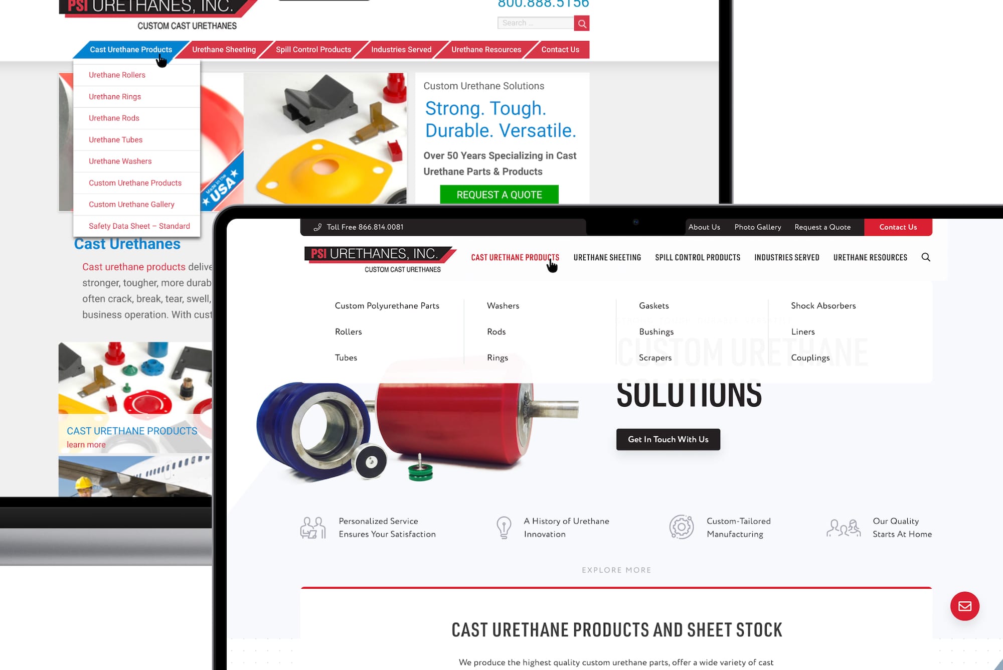
In collaboration with the SEO team, we delivered a new and more educational version of the website with simplified navigation, highlighting benefits, materials, and industries on almost every page, improving the blog experience and naturally integrating case studies with each page.
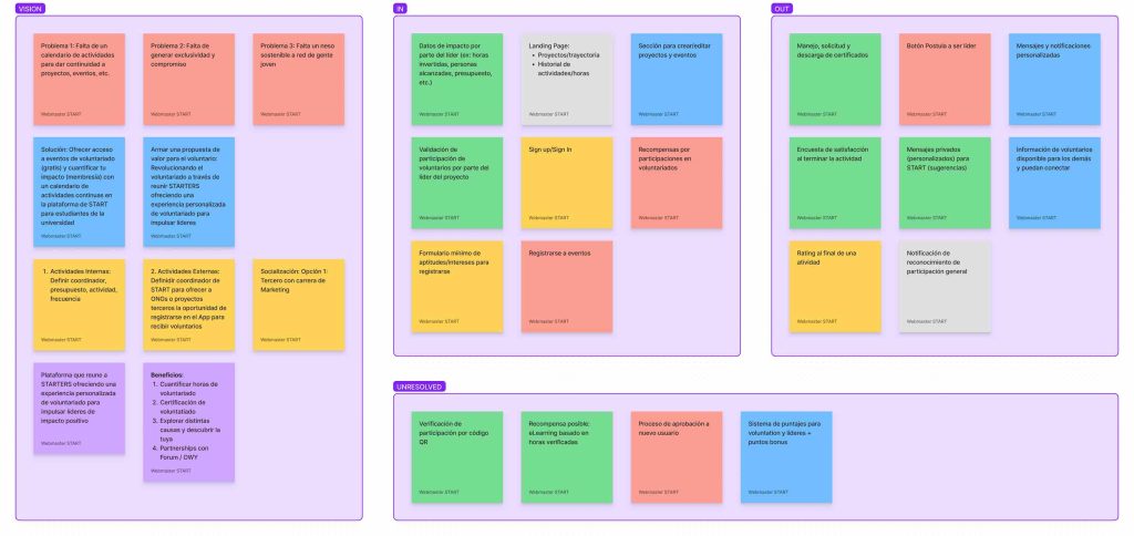
Exploration and classification
PSI led in the local search landscape thanks to the efforts of the SEO and Paid Search teams but confirmed fighting to stay relevant with the many recent changes in the urethane industry, such as technology, prices, and delivery times, among others. To identify these patterns, I analyzed multiple forms submissions sent by website users, listened to internally recorded calls, and identified patterns from the three years before starting the project.
Design System
At the beginning of the project, we asked the client to share their latest marketing materials to compare them with the website and plan a design system that better reflected all elements of the company. Among the updates was the introduction of two more modern fonts: URW DIN and Circe Rounded, and their different variations of weights. I kept the red and black as primary colors and replaced the green (previously used for buttons and accent colors) with red and black interchangeably. I increased the opacity to the color palette blue used for specific headers, added a desaturated blue for some background colors, and a very subtle gray to break up the sections.
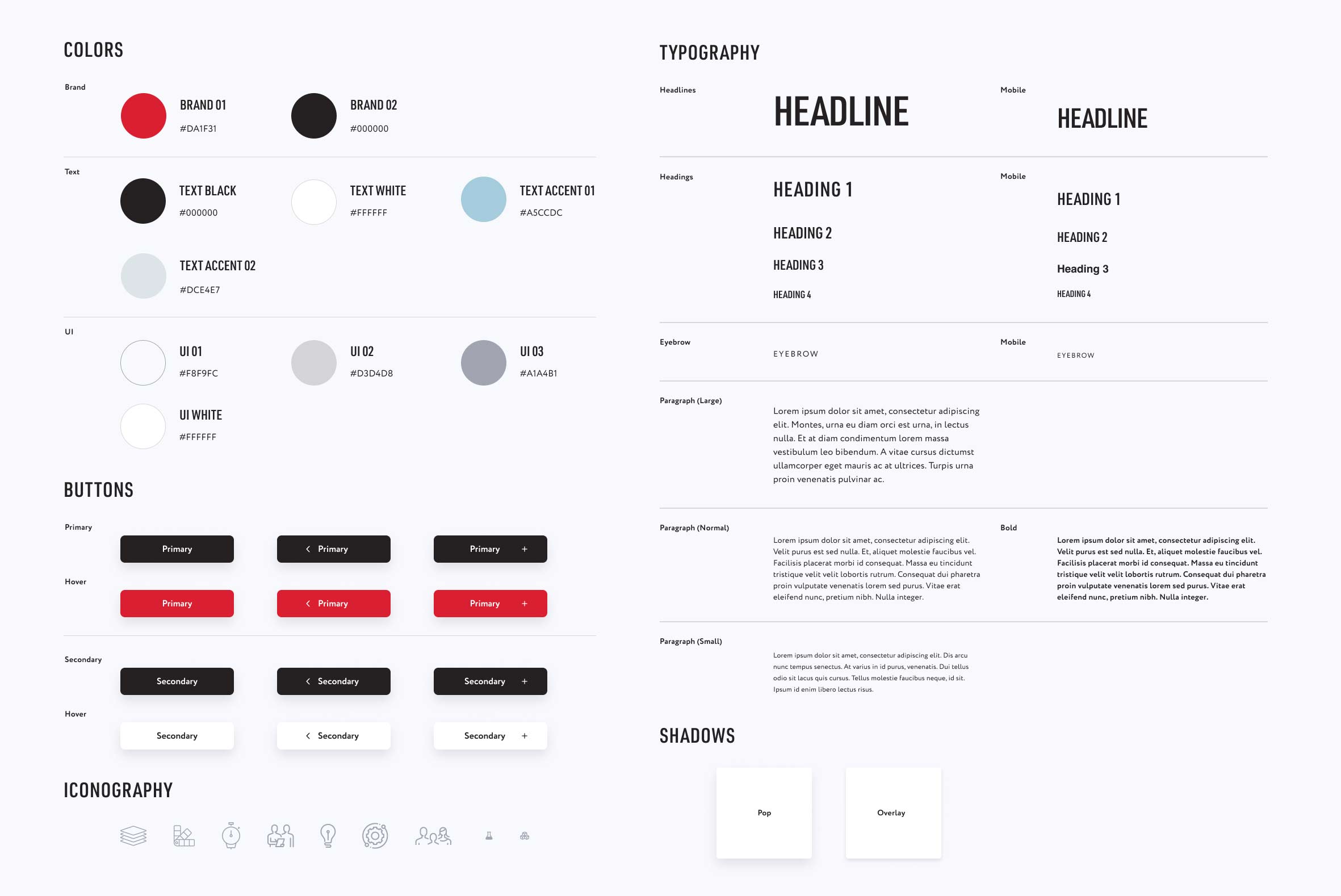
Findings and Components
During the data analysis, many form submissions suggested additional modifications contributing to even better results. Among them:
- Mega menus with simplified language headings, allowing for further expansion (collaboration with the SEO team).
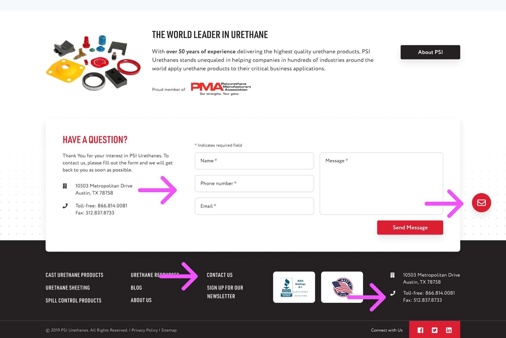
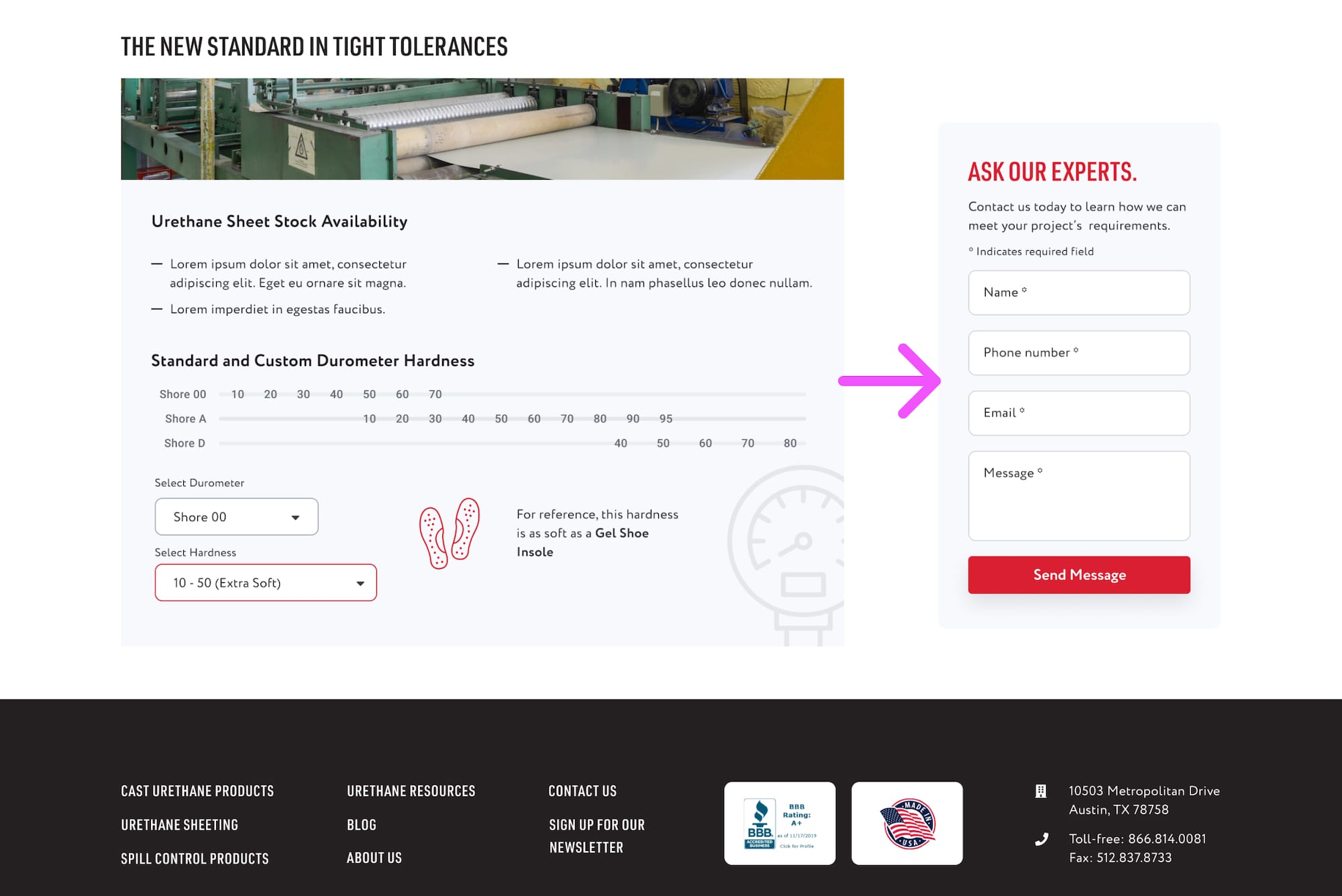
- Additional elements to get in touch and ask for a more obvious quote.
- Calculators to guide the user to make more specific queries.
Mockup design and Prototyping
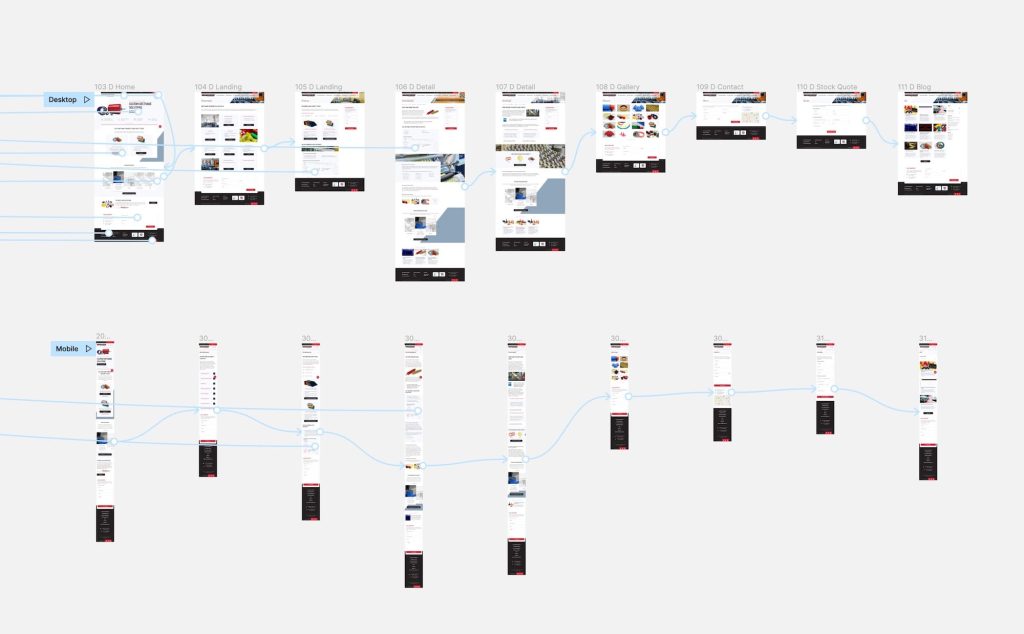
Using Figma, I designed two mockup flows: desktop and mobile, and after receiving the client’s approval, we proceeded to the handoff and development of the website. Later, I worked on design and functionality audits to check the quality of the final product before pushing it live.
