Conversions speak louder than traffic
Founded in 1920, Farmers Copper is recognized as one of the oldest family-owned and operated metal service centers in the United States. Passed through four generations, it has maintained a diversified inventory of copper, brass, bronze, copper-nickel, carbon steel, aluminum, and stainless in its 275,000-square-foot warehouse.
THE PROBLEM
Farmers Copper came to the firm to expand its marketing efforts. Their website did not have the necessary technology to capture potential customers: from the essential elements such as the structure of the sitemap to the user experience and the content layout of each page.
THE CHALLENGE
Farmers had been a client of the company for several years. They had digital marketing services with us and were not convinced to develop a new website after multiple attempts from our end. However, celebrating its centenary anniversary became the perfect excuse for their commitment and to allow the company’s further growth with the help of the digital audience. All the data collected during the previous years helped the whole team to create an even more robust strategy during the planning of the website.
THE Result
Over the first six months since launch (late May 2021), overall form submissions increased by 85.49%. Organic form submissions increased by 64.33% in the first three months post-launch and increased by 80.91% in the first six months.
Discovery and Exploration
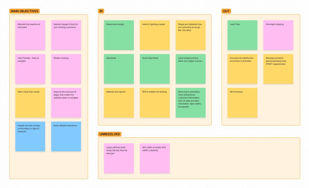
Even when we had enough data from a long partnership with the client, we coordinated additional meetings to share our recommendations, know their preferences/objectives, and set new expectations with them. During these conversations, we collectively defined three critical goals for the minimum viable product:
- Maintain the essence of the brand but deliver a product that shows a radical refresh for their existing customers
- Attract more customers through a responsive design focused on users who visit from mobile devices
- Improve the website structure, making it easier for users to navigate the site
Information Architecture
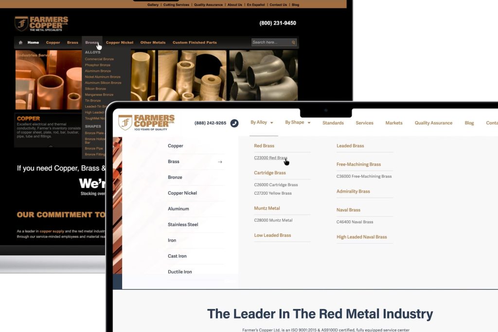
To rethink the structure of the 350 pages of the website, interaction patterns, and navigation, I examined the website traffic data collected in recent years, along with the conversion results. One of my first discoveries was that most users searched by metal shapes and then for the material. It motivated me to lead the navigation with the item «Shape,» then «Material,» and finally «Grade.» Considering that expert users would know exactly what they were looking for, I planned to design an «Alloy Finder,» an additional search element that would be incorporated into all pages, providing an alternative to finding the product they are looking for more directly.
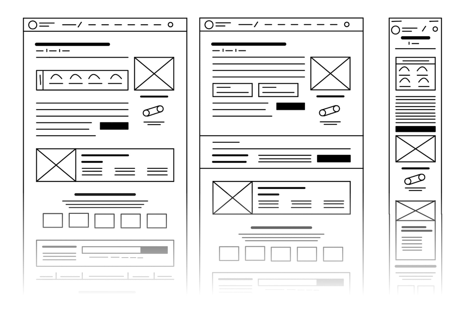
Wireframing
Another effort for the new website was to analyze the content of the most visited pages, the amount of time the average user spent on them, and the heat maps that reflected the interaction of users with the elements present on each page. Comparing that with the forms submitted by users, I identified opportunities to restructure the content by designing new elements to display relevant information and make the content easier to scan.
Mobile First
The data collected showed that the traffic of the original website through mobile devices was 18%, a high percentage for a website that was not responsive. Users would have to pinch to zoom in to scan the information. While mobile traffic was high, the conversion results did not show the same level of engagement. So I decided to focus the new design experience on mobile users, starting with the elements that promoted conversion increase, such as calls to action, navigation, and quick contact forms.
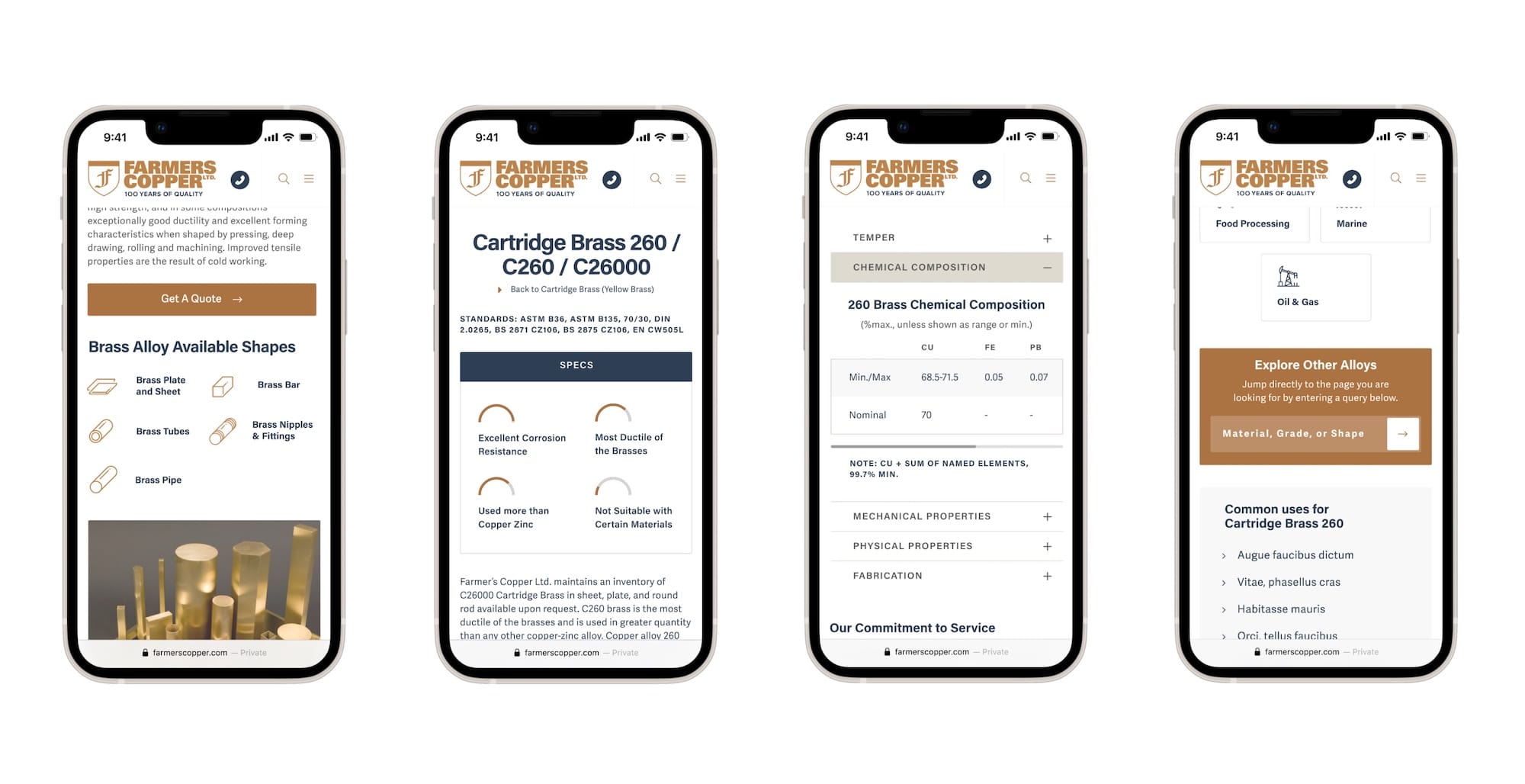
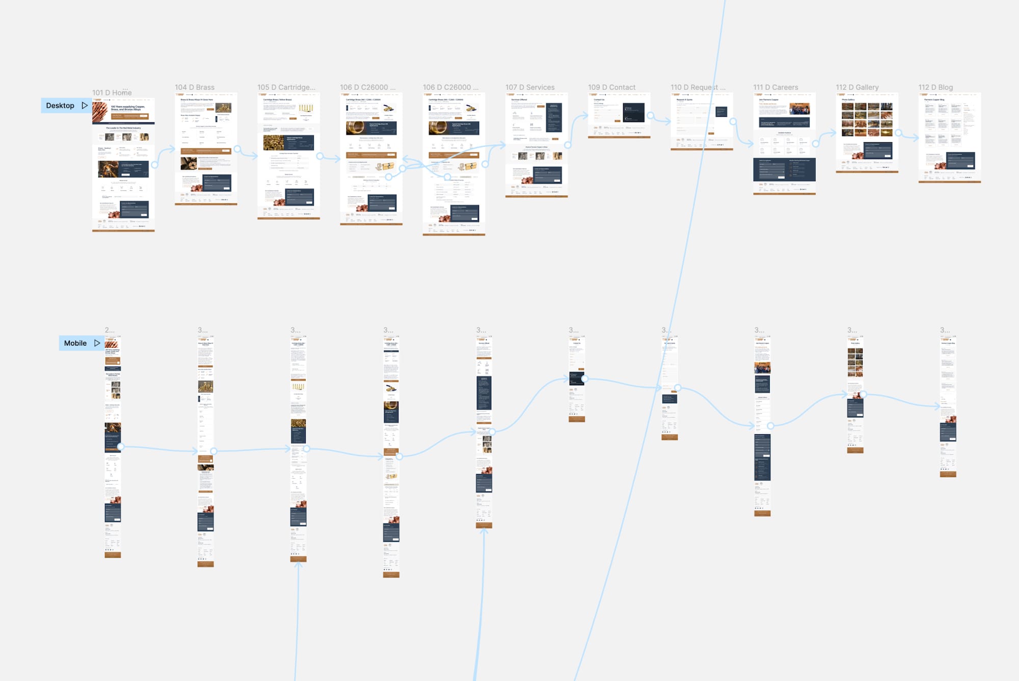
Prototyping Flows
I created a series of mockups for each of the pages using Figma. I worked on the prototype to present the solutions and user flows to the client and prepared the handoff for the developer. Once the developers completed the build of the responsive website, I audited the development to confirm that the functionalities worked as proposed. After four months of launching the website, the firm observed an increase in completed forms of 85.49%. Organically filled-out forms increased by 64.33% in the first three months of the launch and continued to rise by 80.91% in the following six months.