Revolutionizing volunteering in Bolivia
START Americas Together is a volunteer hub that seeks to connect human resources with other non-profit organizations to generate a social and environmental impact.
THE PROBLEM
START had a super high volunteer engagement streak until 2020. Approximately 80% of its members participated in face-to-face activities quite frequently. With three teams present in the cities of Cochabamba, La Paz, and Santa Cruz, COVID not only extinguished that flame in the members’ motivation overnight, but that pleasure they felt when connecting in each activity vanished.
THE CHALLENGE
Between the effort to organize virtual events to keep members outstanding and thousands of monthly meetings of the team of leaders, the idea of starting the development of an application focused on the volunteer experience was born. With that application, the first of its kind in Bolivia, they would be ready to return more organized to continue expanding the team.
THE SOLUTION
We formed two teams: UCB students and volunteer START developers, who managed to launch a functional web application that evolved into a native application for iOS and Android. The vision of the appl is to continue adding more features with the help of the volunteers’ feedback. Both apps would offer volunteers a space where they could see the number of hours spent, discover new activities and projects, open doors to learning opportunities, and take leadership positions thanks to a system of healthy competition.
Discovery and Exploration
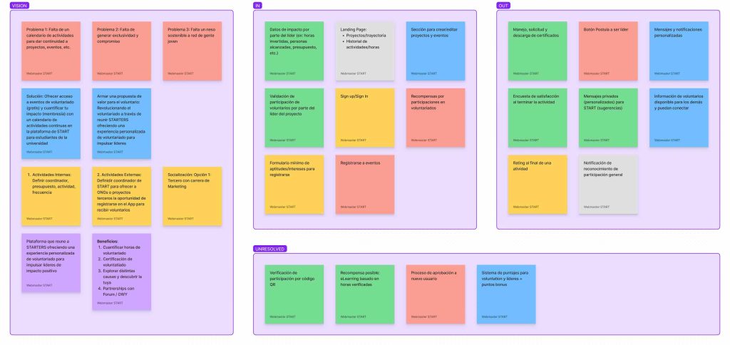
The project’s first phase included multiple virtual exploration and design thinking sessions with a team of 16 members: 6 from START in different roles within the organization (including me) and ten members of the UCB (including PM, developers, and programmers). The objective of the meetings was to define the vision, goals, and roadmap with milestones, functionalities, and priorities. The sessions revolve around the following themes:
- Transparency: Volunteer portal where they can view the hours spent and export certificates themselves.
- Personalization:Suggested causes and events based on the volunteer’s preferences when creating their profile.
- Gamification:Reward system to motivate the volunteer to continue engaging in activities and take leadership positions within the organization.
Design System: Austin
The app’s project motivated the standardization of START’s visual identity for digital platforms such as the application, website, email marketing, and social outlets. While many of the styles created by the volunteers pushed for innovation for the organization, others resulted in a disparity between the different communication channels (specifically affecting the message, brand, and communication). During this project phase, I took on the role of Product Designer. I took the opportunity to evaluate the design elements of past projects and classify and organize the design tokens to start the development of Austin, START’s new Design System.
COMMON POINTS
I started by creating sketches for potential views of the application, analyzing the content on the website and emails previously sent to volunteers to identify patterns in the different media and define the components we would need to include in the Design System.
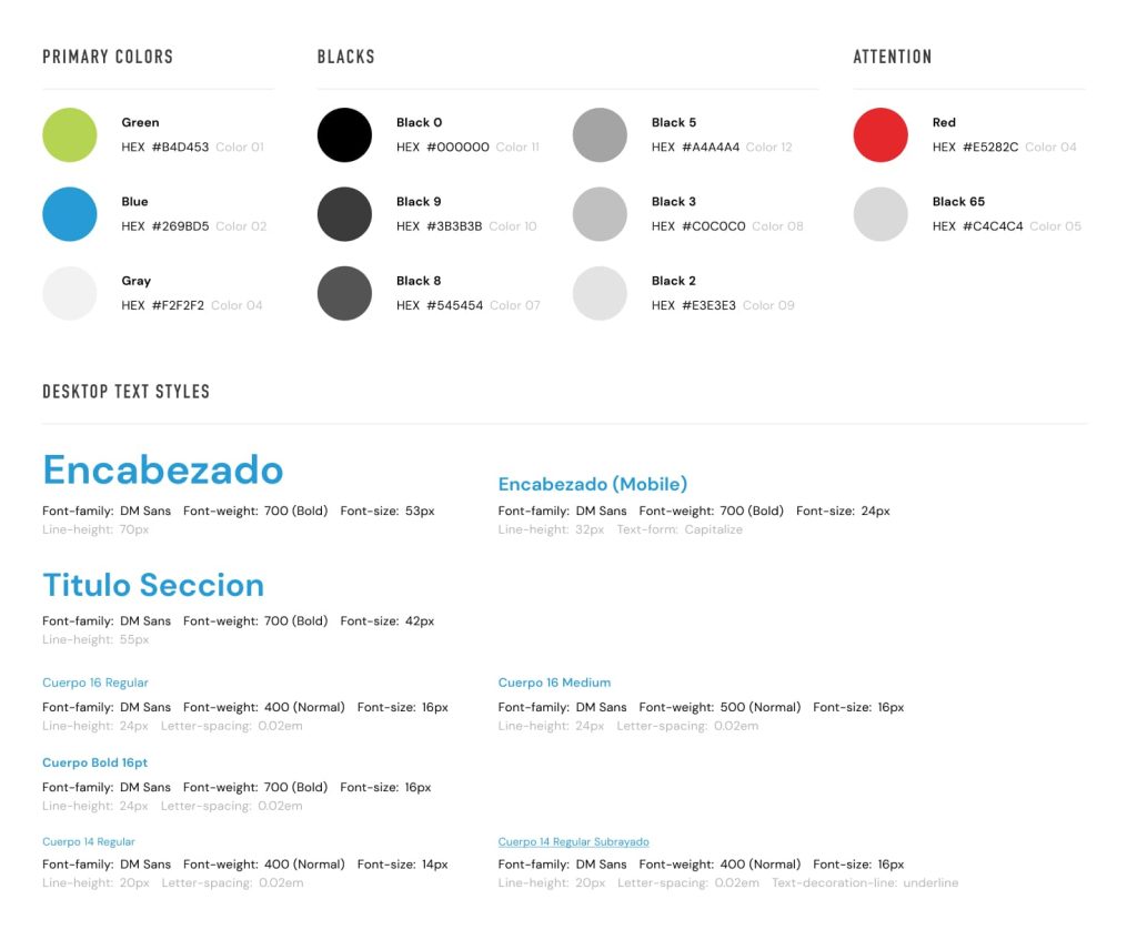
COLORS AND TYPOGRAPHY
Through this process, I standardized the color palette and defined primary and secondary fonts for all digital media and their respective variations of scales.
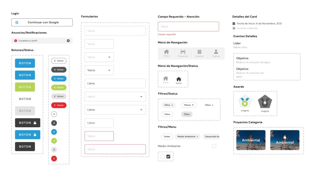
COLLECTION OF COMPONENTS
Inspired by the application, the collection of components in the Design System came was born from the three main themes: transparency, personalization, and gamification. Among the components were the «cards» (as the team likes to call them) invented to individualize projects and events, icons, buttons, labels, form fields, pop-ups, and their respective variations.
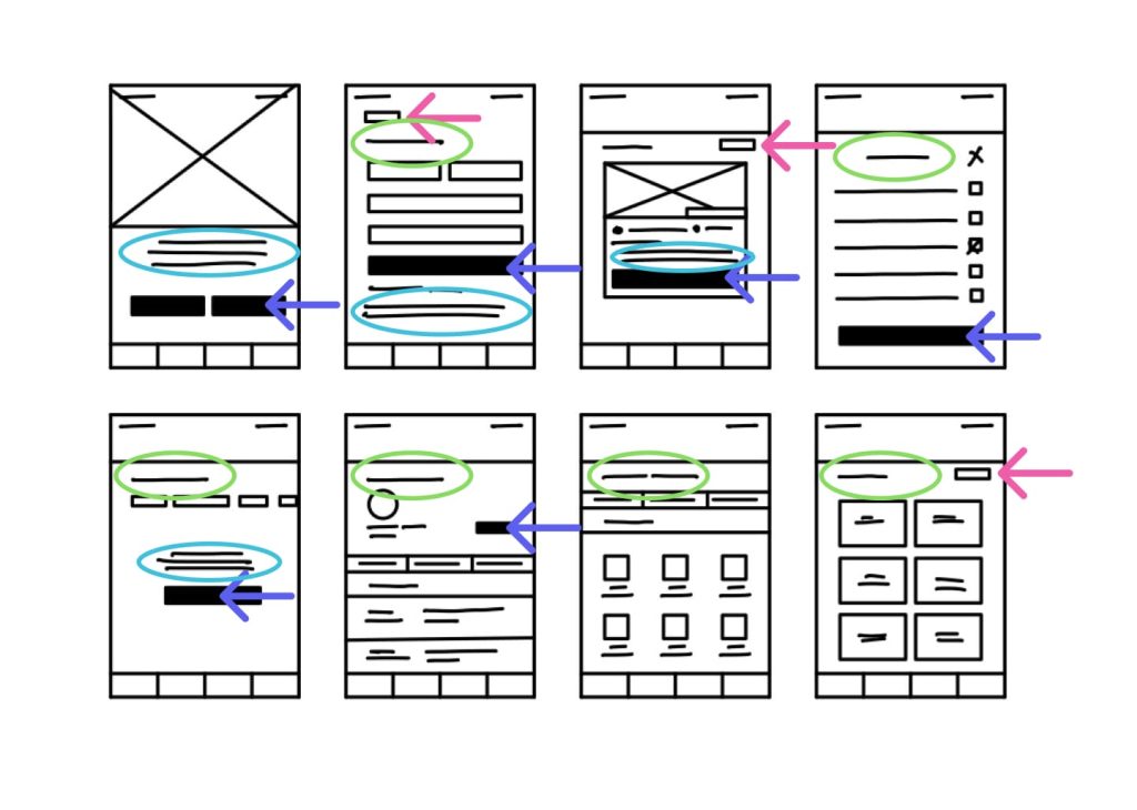
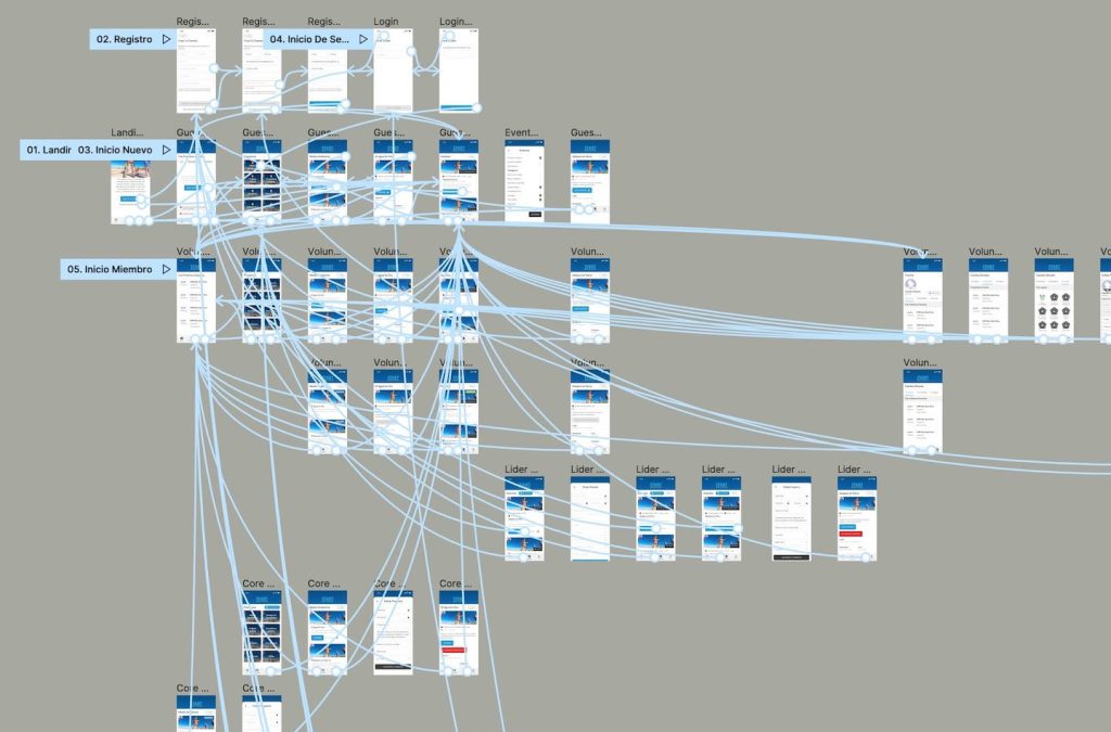
User Flow Wireframes
During this stage, the design team created wireframes to share in meetings with the rest of the START and UCB team and scrutinize and exchange ideas about possible user flows. Later I worked with two designers who created low-fidelity views for the application: one designed for the mobile web application and the other for its equivalent in the desktop version.
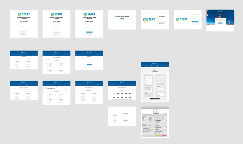
Prototyping
In this phase, I dedicated myself to educating designers on how to implement Austin (the new Design System) into each of their screen mockups. Once completed, I took charge of the quality assurance, prepared the prototype to be presented to the rest of the team, and finally prepared user test interviews with a group of active volunteers who had never seen the application before.