A more resourceful experience for parents
The Banff School has been the leading private school in Houston serving grades PreSchool – 12th grade for over 50 years. Low student-teacher ratios, combined with dedicated, experienced teaching staff, allow them to help their students realize their full potential. Their goal is to achieve academic excellence for all in a nurturing and academically-engaging environment.
THE PROBLEM
With a pretty informative but outdated website and content management system that provided little flexibility to make edits, Banff Schools decided to overhaul the entire website to have more control and expand its digital marketing efforts.
THE CHALLENGE
Design a new website that is still informative but more transactional with which the user can interact more and maintain more fluid communication with parents. Banff wanted to incorporate more images on the entire site that would highlight their planned activities and a gallery with events, trips, etc.
THE SOLUTION
All new elements created for Banff, including the new structure, were designed to support the website’s continuous growth and, therefore, of the school and its community. The website can now be accessed easily through mobile devices without content limitations.
Identity and Design System
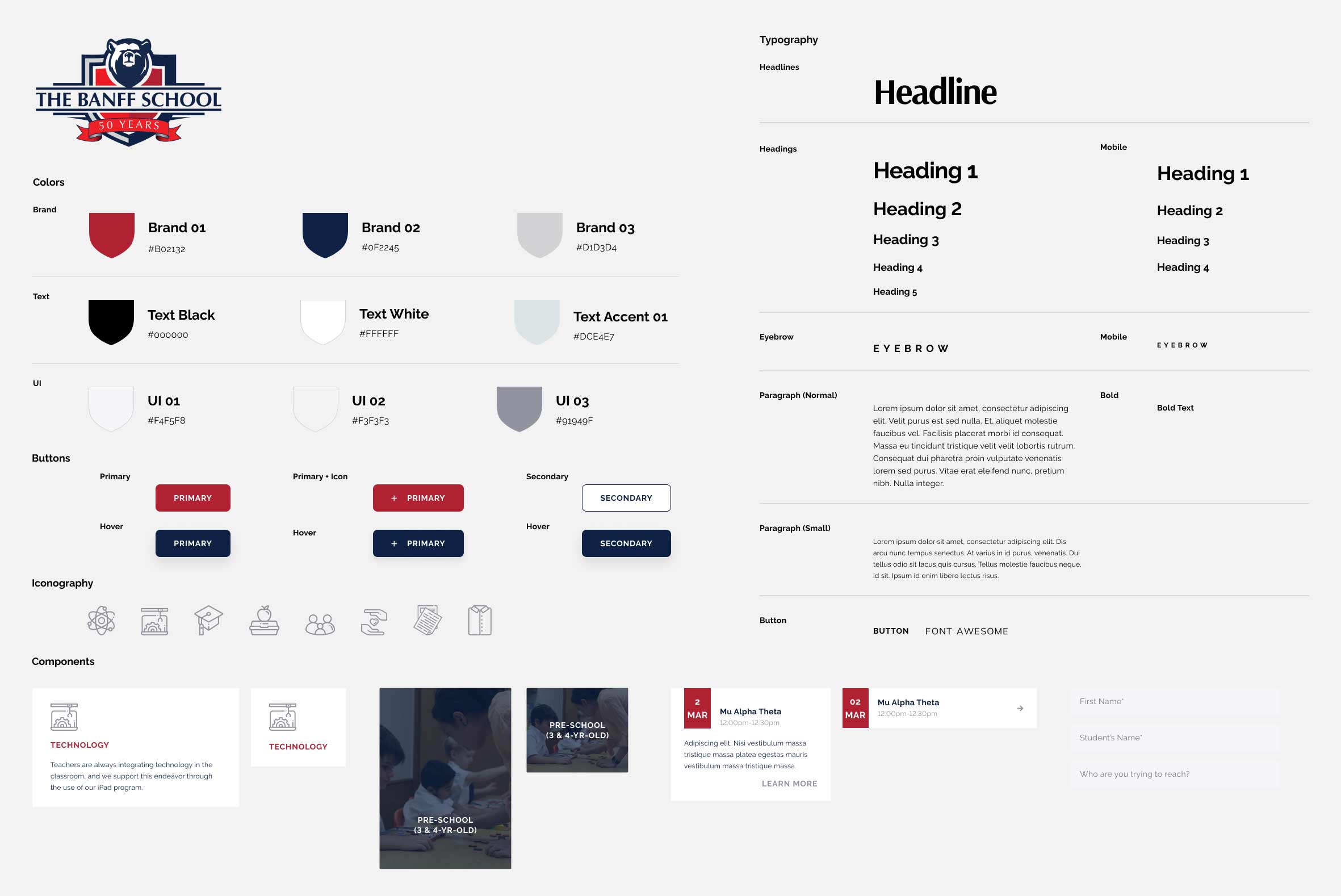
After assessing their old website, I identified opportunities for improvement. Among those was introducing a new alternative font that had the right balance between modern and educational. The font pairing I picked was Arsenal and Montserrat (Both Google Fonts, so the client could incorporate them on their other marketing material without needing a subscription). I suggested the client go for a website with a lighter theme to take advantage of the white space and give it a more modern look compared to their old dark blue theme. The base of their identity provided an excellent direction, so I came up with a design system that structured the brand a little bit more, emphasizing all its essential elements. I kept the same shades of blue but incorporated more opaque reds to allow for accessibility and flexibility with new content.

User Flow Wireframes
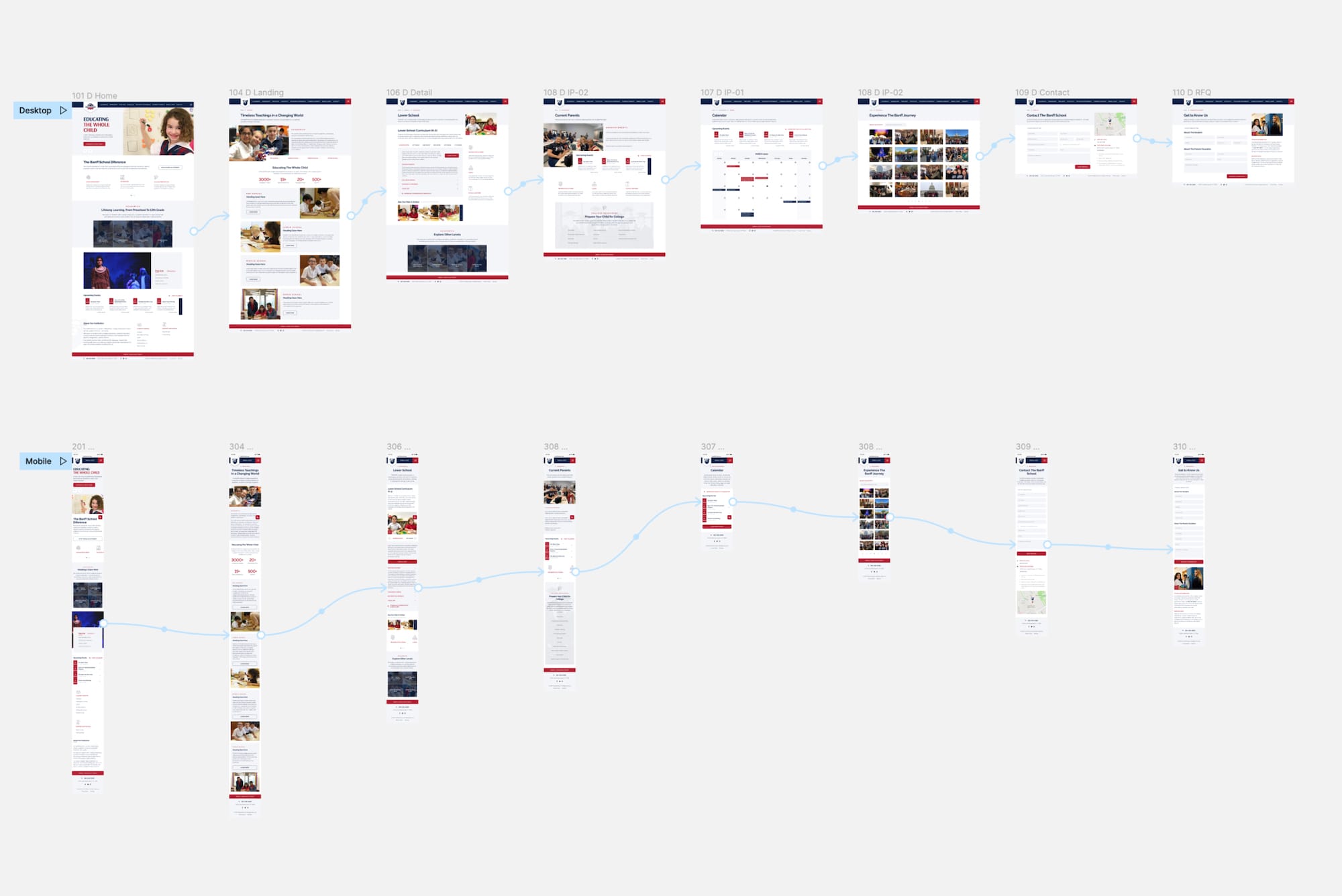
Based on the ideas that the client shared during our exploratory call, I came up with a few elements that would come in handy for users:
- A dedicated section with resources for current parents that included an events calendar, forms and waivers, uniform store, and college preparation resources.
- Calls to action across the site inviting to schedule a campus tour.
- Easy-to-find call to action to enroll a child.
- More structured layouts for degree plans.
Prototyping
Using Figma, I turned wireframes into high-fidelity prototypes to present the design internally and to the client while explaining my thought process behind every element. We delivered a modern-looking, user-friendly, and easy-to-navigate website to the client that would support the interest of prospect families, their primary target market.
